5 Steps to an AMAZING Concept Image Board

Whether you’re an artist, a designer or a crafter, your work is most likely rooted in a concept. Inspiration for those concepts can come from endless places, but when it comes to building robust concepts for a collection or a new product, concept boards can be a great place to start. Concept boards are all about painting a picture of how you want something to look and feel perhaps even smell, taste and sound. They help not only to keep your vision on track but they are an excellent communication and inspiration tool for others to understand your vision.

 While Pinterest has enabled everyone the capability of collecting and organizing their favorite images, it’s only as good as you make it. It can be very intimidating and challenging to distill a sea of images. Did you know there are actual strategies for approaching mood boards and ways to ensure they are impactful? Below are my 5 tips for making amazing concept boards that I've picked up during my ten years as a designer. 

1.    Remember your proper nouns! Concept boards should include a person, place or thing. Depending upon what you are designing a concept around, a person may be important to show scale, communicate emotion or showcasing an action. A place can be critical to communicate context, mood or color palette. And well a “thing”…that can be used for just about anything!

2.    Think big AND small. When selecting images make sure to look for both macro and micro when building your composition. Big abstract images can be ideal for setting the tone or creating interest but detail shots that show connections, texture or blank can be just as compelling.

3.    Look beyond Pinterest and your industry! Creating a concept board for a new fashion collection? Look at images of hotels or fine art instead of other designers. Designing a small apartment? Reserach what is new in modular office furniture or watch a runway show for color inspiration.

4.    Take a step back...is the board pretty to look at? Sometimes we can get caught up in the details or symbolism of an image and forget to make sure that the board itself has a strong composition. This not only means the images placement on the page and cropping but also what do all the images look like together? Once you have all the content, I often recommend do another pass and select images that are harmonious. Don’t try to shoehorn a photo you love into a board, let the board build itself organically.

 5.    Break the rules. If you concept board needs more detail shots vs people, include them. It’s your concept! Have fun and be inspired!

~Amberlee

Amberlee Isabella Home


Hat Trend Roundup | Jazz Age Lawn Party

The second weekend of the Jazz Age Lawn Party is taking place in Governor's Island this August 13th and August 14th. During the first weekend of the 11th annual JALP, Junior Baby Hatter spotted a mashup of hat trends from the golden era of jazz up to the swinging thirties and forties. From flat caps to fedoras, here’s a little hat inspiration, and history lesson, if you’re looking to top off your twenties themed costume.

Flat Cap | Rounded cap with a small stiff brim in front

This oldie-but-goodie dates back to England in the Elizabethan Era when hats were required dress code for all common men over the age of 6 by the law. These hats were introduced to American fashion through Ellis Island by English and Irish Immigrants in the early 1900’s and later worn by taxicab drivers with two snaps under the bill to tuck their work tickets. This style of hat is formal without looking too pretentious.

Bowler | Hard felt hat with a rounded crown

Bowlers were created in the late 1800’s for gamekeeper’s to protect their noggins from branches while horseback riding and later worn by 21st century icon Winston Churchill. This hat is just plain dope. Definitely a good choice if want to look like old money from a F. Scott Fitzgerald novel.

Boater | Summer hat made of sennit straw and grosgrain ribbon

These hats wear inspired by Venetian gondoliers and later made popular by Princeton Ivy League students. If you are going for a preppy look, go with a boater hat.

Fedora | Creased, soft brimmed hat

1940’s Hollywood icon, Humphrey Bogart’s tough-guy charm branded fedoras as the go to hat for the strong silent types. Fedoras are good choice is you are going for effortlessly cool.

Cloche | Deep, bell-shaped crown and narrow brim hat

French for bell, the Cloche hat was designed in 1908 by a French milliner. It hit it’s height in popularity during the roaring twenties as the iconic look of flappers with bobbed haircuts.

Custom made Linen Cloche by Lisa McFadden.

Markisha Velazquez is the designer and owner of Junior Baby Hatter, based in Weehawken, NJ. When she’s not making dapper caps for babies and toddlers she commutes to New York with her family and blogs about her adventures in the city.

Highlights from the Renegade Craft Fair: San Francisco

Wish you were here! It was a beautiful day in San Francisco when I attended the Renegade Craft Fair at the Fort Mason Festival Pavilion. The event showcased over 300 makers selling a variety of handcrafted items. It was fun to chat with fellow artists and enjoy food truck snacks against the backdrop of the San Francisco Bay. So here's a shout-out to our Etsy friends on the West Coast!

Build Your Own Bento Box: How cute is this? At TwinkieChan's Bento Bar, the market-style display encouraged the creation of an original Japanese box lunch with the really sweet crocheted food! Visitors were delighted by the fun DIY's offered by the creative vendors at this Renegade fair. 

Keep It Clean: Everyone needs a good apron. Todd at Tenden designs these canvas and leather aprons, along with cool accessories, such as well-made utility rolls and leather pouches. 

Under Lock and Key: I love when the mundane is turned into something amazing and unexpected! While the old car key rings on display at Goat and Kettle are from the 1970's, some pieces date back to the 1800's.  It's fascinating to imagine what these old keys may have opened long ago! 

Piperoid Characters: These colorful paper robots from Magnote are irresistible!  Each one requires only scissors and your hands to manipulate the sheets into interlocking tubes. So hard to choose just one!

Can't wait to attend the next fair! Check out http://www.renegadecraft.com to find fairs in your area.

Post by: Nicoletta Siccone / ETSY Shop: ArtologieDesigns / Website: www.art-ologie.com

Nicoletta Siccone is a lifelong artist and art educator, with an M.A. in Art Education and Administration. She travels the world seeking cultural inspiration for her art, and has worked in fibers, acrylics, oils, and sculpture. Her current work is inspired by the reinvention of the mundane zipper, elevated to an art form into unexpected jewelry designs. Nicoletta’s artwork is shown throughout New York/New Jersey and worldwide.

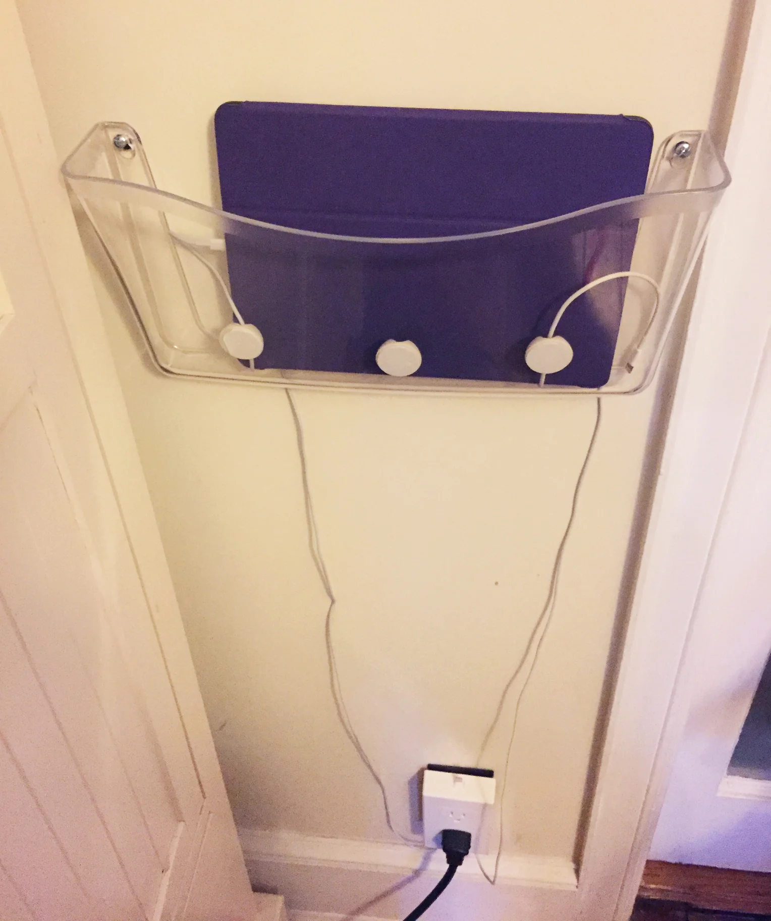
DIY: Charging Station

Would you like to create a central location to charge your devices instead of having to search around your home to find where you or your family members might have plugged in a phone, tablet, etc.? I created an easy DIY charging station that I’d like to share with you.
Read More

EtsyNY Travels: Tokyo, Japan

I have always been fascinated with Japanese culture, especially the varying forms of Japanese art, and the breathtaking care and attention to the smallest details that is ever-present in the arts of Japan.  From calligraphy, painting, lacquer, textiles, even knife skills and cooking, lifelong devotion to specific techniques has resulted in a focused expertise with gorgeous results. For all these reasons and more, Japan was at the top of my travel list, and I was so excited to travel there during cherry blossom season this past spring.

Our first stop was Tokyo, a city of fascinating juxtapositions: both bustling and impeccably clean and orderly, with modern architecture and neon lights abutting thousand-year-old shrines, where you can go to kabuki and a robot restaurant in the same afternoon.

We were charmed to see that Hachiko, the statue in Shibuya of the loyal dog who waited for his owner at the train station every day for almost ten years, had a friend, a contented, well-cared-for blind cat. 

We also visited a handicraft center in Aoyama where the supplies were nearly as beautiful as the incredible artistry!  

We watched a kimono being hand-embroidered with stitches I could barely even see.

It was wonderful to see a beautiful bride in her photo-ready finery.

The robot restaurant in Shinjuku neighborhood was too unique to really capture in a few photos, but the psychedelic stairways give a little glimpse of the experience.

One of the highlights of our time in Tokyo was a visit to the owl cafe Fukuro no mise.  This is exactly what it sounds like: a sweet little cafe with a few dozen adorable owls that you can hang out with and befriend. 

I love all sorts of Japanese food, and each meal was an opportunity for another amazing culinary experience. There was an incredible variety to our eating each day: a quick stop for takoyaki (pancake-like balls with octopus inside) from a street stall, wandering the giant food courts in train stations, an entire evening at a refined sushi counter, a tempura shop that only served giant golden-fried shrimp, French pastries and perfect lattes, or early chirashi breakfast at the Tsukiji fish market.  I loved how each restaurant and stall was so good at its own specialty. (eight kinds of eel in one tiny restaurant! an incredible ramen counter with only three perfect options! And of course, the best sushi I've ever had in my life.)

Ordering at this shop in the fish market meant pointing at the bowl you wanted with this little fish pointer!  Solves any language barrier...

I also did a lot of shopping in Tokyo.  Vintage shops in Harajuku yielded amazing vintage bargains (while I didn't get to take home this silk bomber jackets, I did score lots of other fun finds including a gorgeously embroidered silk kimono), and I also brought home lots of adorable souvenirs.

Of course, we did more than eat and shop!  The famous Meiji shrine was lovely, and a day spent in the Asakusa neighborhood meant meandering between restaurant supply shops, dozens of shops selling as many trinkets as you can imagine, handmade paper, dishware and more, and bustling shrines, after a morning spent at the traditional kabuki theatre.

I may have only spent a few days in Tokyo, but I felt like I got to soak up as Japanese culture as possible in the short time I had there. Bright colors, intricate details and patterns, Japanese brushstroke techniques all provided inspiration for my own painting!

Next up... Kyoto!

Lauren

Wandering Laur Fine Art

Guest Post: How to Take Better Instagram Photos with your Cameraphone

Phone photography is the way most people snap pictures these days. Gone are the days where you absolutely need a high-quality camera; with your phone you can snap quick photos throughout your day.  Many of us put those quick photos on Instagram for sharing with friends and we're all trying to capture the best way to make our photos more interesting and stand out. I want to share some helpful tips that I use for creating better photos with my camera phone for Instagram. Each tip comes with an actionable step so it's not just about reading but also about doing!

1. Find a well exposed spot. In simple terms, exposure = how light or dark your photo is.  Exposure will make or break your photo and at times it can kind of seem daunting. At it’s core, it really isn’t so I’ll try to stay away from the technical speak. Photographs that are too bright or washed out (think of those college days photos where everyone is squinting their eyes because of the flash and you can’t tell where you face starts and the white wall behind you ends) reside on the “over exposed” end of the spectrum. Photographs that are dark and grainy veer more towards the “underexposed” end of the spectrum.

Because creative freedom is important, don’t necessarily think of one of these being right and the other being wrong. Just use it as a barometer (kind of like knowing the rules just so you can break them). Below I give you the general steps on how to edit or play with the exposure in three different cameras.

  1. Iphone users: If you have an iphone simply take a finger and press down onto the screen. You should see a yellow box appear along with a yellow sun on a line. Hold that sun icon down while sliding it up and down the line--you’ll notice that the image on your screen will either get darker or lighter.
  2. Android users: while I currently own an iphone, I’ve used both Samsung & Sony phones at length and if you poke around the settings in your camera app you will most likely come across a sliding scale with the letters “EV”. This controls the exposure.
  3. VSCO camera: Tap the screen with two fingers and you will see two red circles pop up--one for Focus and one for Exposure. Move the exposure circle to the part of the image that you want to correctly expose for.

Action Step: Walk around your house snapping pictures of things while playing with the exposure. Take note of the room you're in, your location relative to the light source (light bulb or window) and how that affects the exposure. What do you like better? Dark moodier images or those that have an abundance of light?

2. Use your grid to help with composition.   Some people might find this helpful while some will find that they function better without it. While I don’t always use it, I do know that when I have it turned on I’m much more intentional about the images I’m composing.

Action Step: Turn on the grid on your phone and use it to help with your composition. Do you find it helpful or prefer it off?

3. Don’t be self conscious. This is for those of us that love photographing in public...but also kind of hate it. Just walking by the streets and seeing something we want to snap a picture of but deciding not to do it because we’re worried about what others will think. Trust me, I’ve been there so many times--I’m still there a lot of times! But I hate the feeling of regret and I always feel better when I suck it up and take the time to take my photograph properly.

Action Step: The next time you go out make it your goal to stop and take at least one picture when you feel compelled to. (at least one!)

4. Variation. Never just take one photo and assume that it’ll be the perfect picture. I can’t explain to you how important it is to not only do several takes (because often times that first take is not perfect) but to also do variations of the same shot. Sometimes we forget that we can actually move with our camera phones in our hands and take an image in different angles. The end result will leave you with images that you might not have even initially set out to take but end up loving more than the one you saw in your head!

Action Step: Take 5 different compositions of the one photo subject. Zoom in. Zoom out. Shoot from a lower level. Over head. Move things around in the frame. Just give yourself the freedom to mix it up.

5. Pay attention to the details. One of my favorite things to photograph is just everyday moments. Everyday moments that feel good to us, that means something to us. It could be your child’s hand grabbing for some snacks on the table, or you standing in the kitchen early in the morning with your funky socks on, enjoying a cup of tea in the quiet of the morning. These moments hold beauty and they resonate with people. Don’t forget about them.

Action Step: As you go through your day be more mindful and stay in the moment. If that moment resonates with you and you want to capture it, pull our your smart phone (and use steps 1-4 to help do that moment justice!)

I hope you guys found this helpful! I personally love Instagram, even before I started using it for work related purpose. I find that the best content that can be created is the one that we actually find inspiring. Your feed doesn’t need to look like everyone else’s because your life, your vision, the way you see the world --that doesn’t look like anyone else either. Give yourself the freedom to create and have fun with this. Keep experimenting and practicing and I promise you’ll see improvements :)

About Nadeena (Our Guest Blogger): Nadeena is a visual brand strategist and photographer for creative brands. She resides over at Art & Anthem but you can also chat her up on Instagram (because she seriously lives there).