5 Steps to an AMAZING Concept Image Board
Whether you’re an artist, a designer or a crafter, your work is most likely rooted in a concept. Inspiration for those concepts can come from endless places, but when it comes to building robust concepts for a collection or a new product, concept boards can be a great place to start. Concept boards are all about painting a picture of how you want something to look and feel perhaps even smell, taste and sound. They help not only to keep your vision on track but they are an excellent communication and inspiration tool for others to understand your vision.
While Pinterest has enabled everyone the capability of collecting and organizing their favorite images, it’s only as good as you make it. It can be very intimidating and challenging to distill a sea of images. Did you know there are actual strategies for approaching mood boards and ways to ensure they are impactful? Below are my 5 tips for making amazing concept boards that I've picked up during my ten years as a designer.
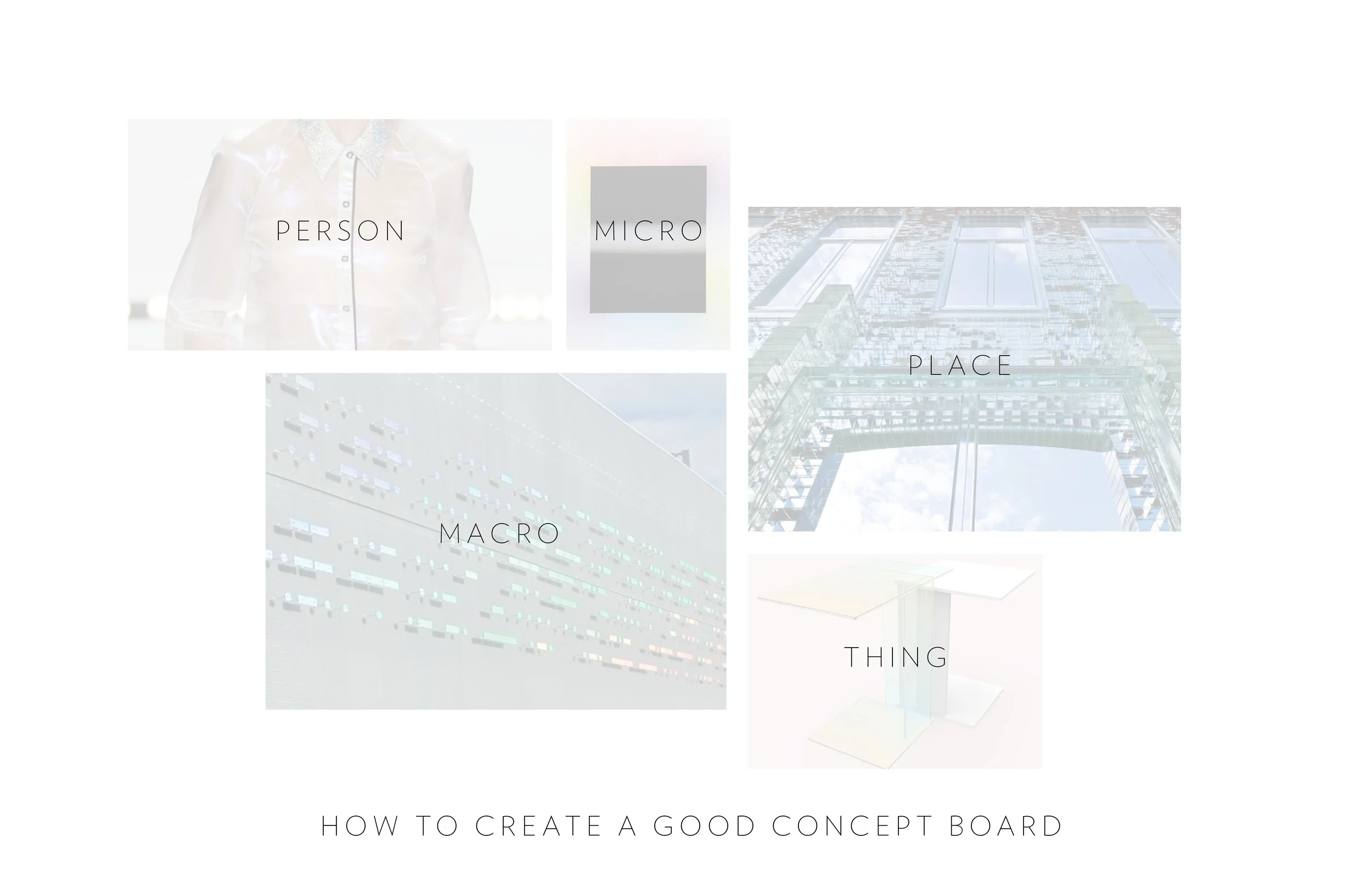
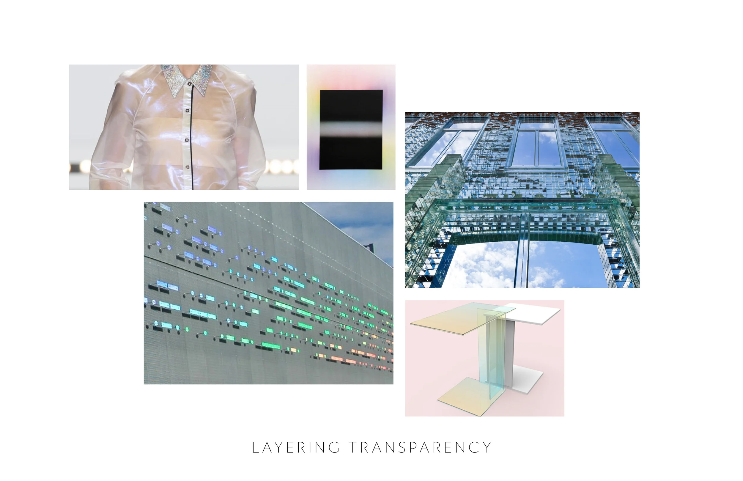
1. Remember your proper nouns! Concept boards should include a person, place or thing. Depending upon what you are designing a concept around, a person may be important to show scale, communicate emotion or showcasing an action. A place can be critical to communicate context, mood or color palette. And well a “thing”…that can be used for just about anything!
2. Think big AND small. When selecting images make sure to look for both macro and micro when building your composition. Big abstract images can be ideal for setting the tone or creating interest but detail shots that show connections, texture or blank can be just as compelling.
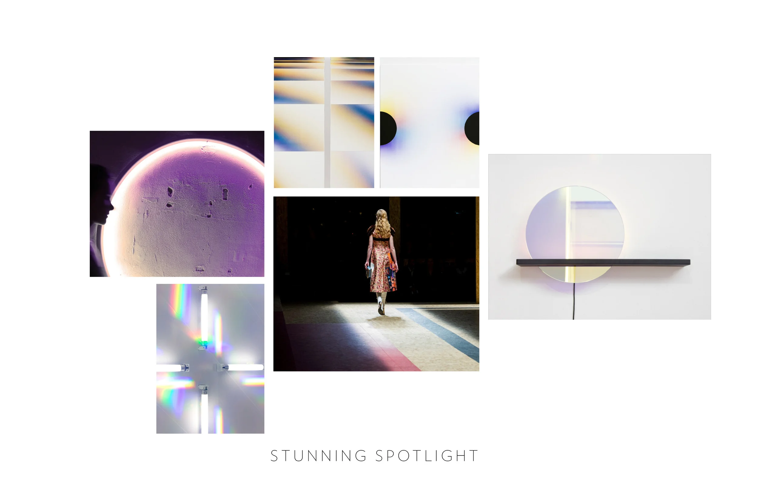
3. Look beyond Pinterest and your industry! Creating a concept board for a new fashion collection? Look at images of hotels or fine art instead of other designers. Designing a small apartment? Reserach what is new in modular office furniture or watch a runway show for color inspiration.
4. Take a step back...is the board pretty to look at? Sometimes we can get caught up in the details or symbolism of an image and forget to make sure that the board itself has a strong composition. This not only means the images placement on the page and cropping but also what do all the images look like together? Once you have all the content, I often recommend do another pass and select images that are harmonious. Don’t try to shoehorn a photo you love into a board, let the board build itself organically.
5. Break the rules. If you concept board needs more detail shots vs people, include them. It’s your concept! Have fun and be inspired!
~Amberlee


