"Design",
"Pantone",
"color",
"wink and flip",
"winkandflip",
"women's wear daily"
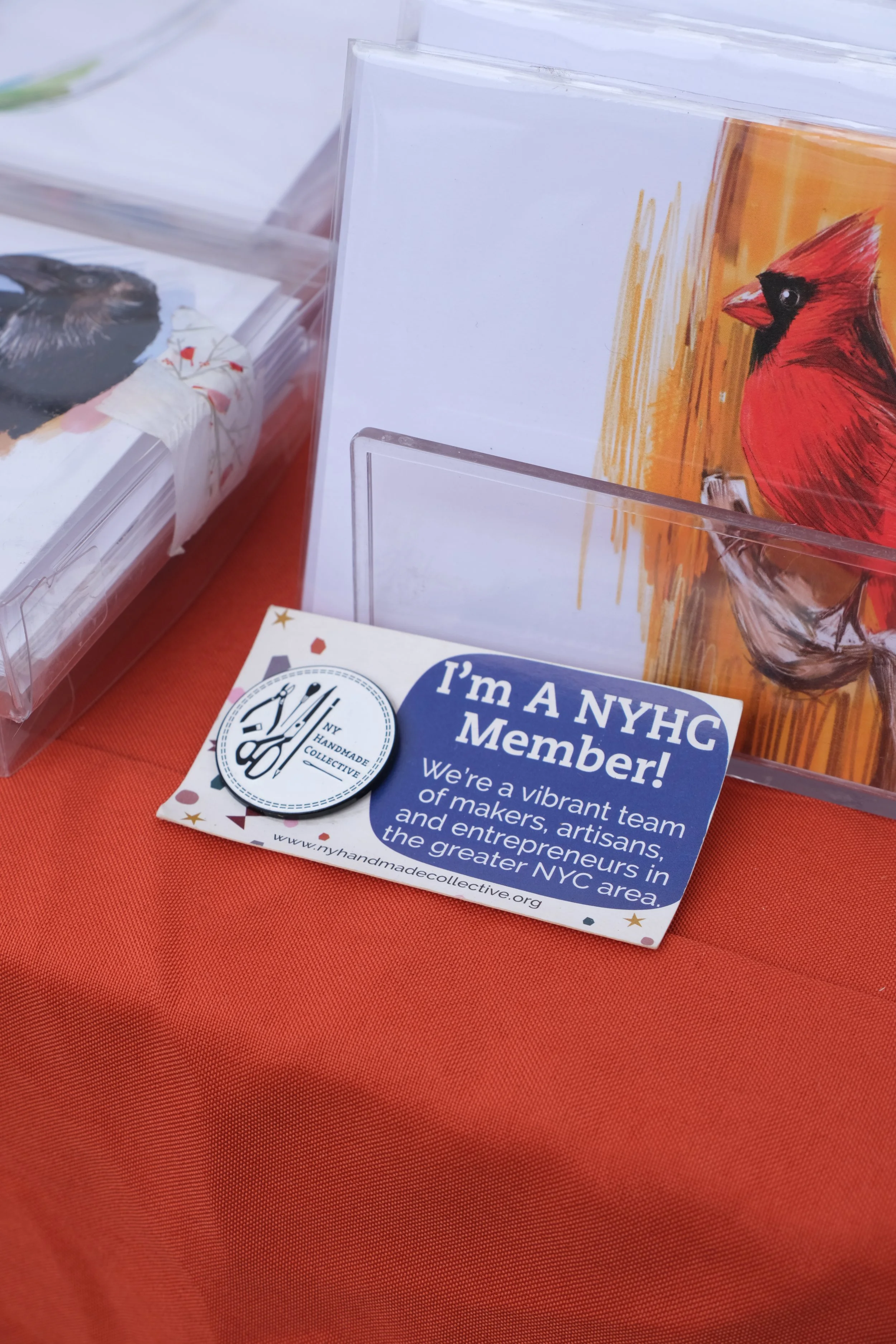
NY Handmade Collective
"Design",
"Pantone",
"color",
"wink and flip",
"winkandflip",
"women's wear daily"
NY Handmade Collective
Read More
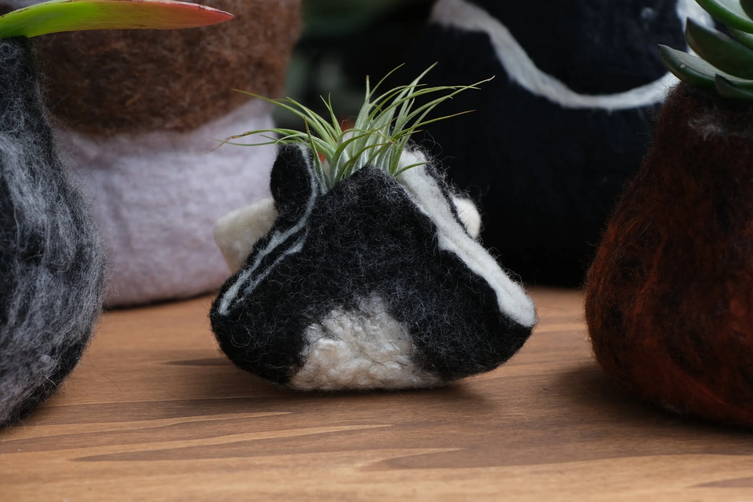
"color",
"flowers",
"new new team",
"spring fashion",
"spring",
"springtime"
NY Handmade Collective
"color",
"flowers",
"new new team",
"spring fashion",
"spring",
"springtime"
NY Handmade Collective
Read More