MERCHANDISING MERCHANDISING MERCHANDISING
The spring craft show season is upon us, even if the weather isn’t quite cooperating yet. So many fairs and shows and exhibitions to apply and prepare for, many of which are jam-packed with talented artisans. I myself am a jewelry maker, which makes things exponentially harder. Among all the other issues related to the making, applying and selling, I also really have to think about how to best to display my wares, in hopes that I may be seen within the craft show sea of stunning handmade goodness.
I am finding that a great table or booth display rides a very a fine line. You can’t be too slick or too cluttered; you don’t want to have too little on display and yet you don't want to overwhelm with choice either. You have to both fit in and stand out, you have to communicate in an instant a narrative of what you and your pieces are about, which also informs how people will value your pieces. It’s like a thousand job interviews in a day with a nanosecond to make your case!
I feel like, despite my most earnest efforts, that I never quite seem to get it right. I have too much prop clutter or too much product. It’s too fussy or doesn’t jive with the vibe of the jewelry; it looks okay but it’s a pain the arse to pack and unpack. I may have a time or two looked slightly insane by taking so long to set up.
Basically, a rookie who reeks of trying too hard!
Many of you are old pros at this point and have your scene long set in this regard, but I figured, for the rest of us, newbie or associate newbie, and the others who may get a kick out of changing it up, I’d do a little research as well as peruse the interwebs for inspiration and maybe, possibly, hopefully, create an epiphany for myself where it finally ALL COMES TOGETHER.
My favorite article comes from Folksy, written by “Hilary” on July 5, 2010. Titled, “Craft Fair Secrets – How to Make a Great Craft Fair Display,” this piece outlines all the good and important basics to consider when creating your display masterpieces.
Here’s a quick list with a combination of mine and Hilary’s thoughts on the matter:
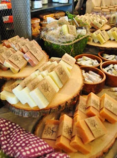
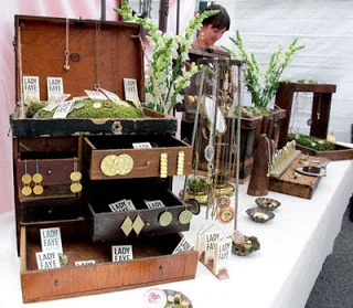
Height – Don’t lay things flat. Use boxes, shelves, or whatever to create levels that cover the area of the table in a thoughtful way. A table needs “white” space too. An old decorator’s trick is to think in odd numbers and think about overall balance and feel and not just strict symmetry. How might the viewer’s eye bounce from one level to another as they take in the scene? Grouping things in clusters gives the eye a place to stop and focus.
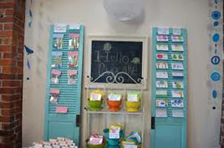
Theme – You, your pieces and your display in a split second tell the person walking by a story and that story influences their perception of your products, their function and their unique value. Edgy, earthy, cheerful, cool or retro? Something that primarily appeals to the very young, or to the nostalgic? The practical man or the sophisticated gal? Who are you selling to and what is going to catch their eye? There are awesome wood grain contact papers to cover anything for a rustic or masculine vibe, and slick modern looks can be created on the cheap at Ikea. Thrift stores can be a treasure trove for hip, romantic and vintage looks. Easels, bulletin boards and PVC pipes from Home Depot can create any number of practical and cool display canvases.
And have you seen what's been going on with duct tape lately? There are just all kinds of colors and textures and patterns to choose from. Runs the gamut from cute to carnal. Snake skin to plaid. Amazing.
Props – You want sturdy, interesting, easily packed props that show off your wares well and yet don’t distract from what you are selling. When in doubt, keep it simple. If your work is colorful maybe your display should be neutral, if your work is neutral then the right shot of color makes all the difference. With a booth you get to think about wall space. And no matter what, find a commercial printer and for a nominal fee come up with a good, straightforward banner and some business cards. Post prominently if you will be able to take credit cards. When I got my little credit card iphone swipe dealie, boy, did things really start cooking!
Price Labels – Label clearly each piece or create a prominently displayed price list if your inventory allows. We all feel skittish and a little self-conscious if we have to hunt for a price, and some of us walk away if we have to keep taking the time to ask.
Space – Instead of the standard six foot table, does your product allow for maybe a small table and a spinning floor rack, or a cute foot stool out front? Can you do a screen behind your table to create a backdrop? Maybe a tabletop screen or rack?
Lighting – not all lighting requires an outlet. Battery operated up lighting can help direct the viewer’s eye and create and warm, inviting little environment within the larger craft show space.
Access – make sure you have eye catching pieces right out front. If at a table, I have learned that a few pieces at the front edge, casually laid flat or on a platter or a runner, draw people even closer in because it seems more approachable. If you have a booth, setting tables up at the front rather than making the potential customer walk all the way in helps to snag those lookers walking by.
Practice – Set it all up in advance the best you can. Better to work out the gritty details at home than the day of the show!!!
Take care everybody. And may all your displays be transcendent and transactions plentiful during this new craft show season. Amen!
Melissa / Prairiefunk


